Before I begin, this isn't a dig at anyone in particular. This is me talking about Scouting Ireland. I'll also state that I'm not perfect nor is neting I do!
Scouting Ireland relaunched their new Scouts.ie website yesterday. This new website will be the public facing, what's scouts about and how do I join for the public to view and get information. This website has also been finished for the last number of weeks, waiting a whole big unveiling at a Group Leaders conference this weekend. So they should be well prepared for their 16:15 launch, which eventually went live at 16:45ish.
I have seen many new websites go live, been involved in many go lives and even had the pleasure of testing, breaking and proofing website before launch. Standard practice, get people to test and look over your website, usability test etc etc. It seems that there wasn't many people left into the inner circle of testing this new website. I will go through some of the things I came up with on a 30 minute quick look through the site last night:
Typos typos everywhere
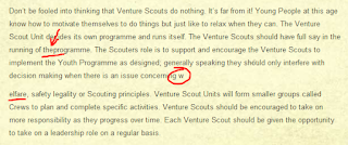
I found a total of 25 typos on a website that contains about 30 pages. In no particular order:
1 & 2 - On the National Management Committee page.
3 to 6 - On the Professional Staff page.
7 - On the Parental Information page.
8 & 9 - On the Campsite Locator page.
10 - On the homepage page.
11 & 12 - On the Join Today page.
13 to 15 - On the History of Scouting Ireland page.

16 & 17 - On the One Programme page.
18 - On the Cub Scouts page.

19 - On the Scouts page.
20 & 21 - On the Venture Scouts page.
22 & 23 - On the Benefits of Join page in the Leaders section.
24 & 25 - On the Why become a Leader page.
Broken / Formatting Errors
Here are some of the things that I found didn't work as expected or there was a formatting issue
1. That Huge Banner doesn't link correctly. On the home page it links correctly to Beavers, Cubs and Scouts but click on the Ventures Banner and your directed to Rovers and click on the Rovers links to Leaders. The Leaders Banner is usually the first one that loads and it doesn't link anywhere. Also If you miss the banner, there is no way to go back, you have to wait until it goes around again.
On any section page, for example Venture Scouts, the banner rotates with different Venture Scout images and click to find out more (Why would I want to click when I'm on the page?), but they say Ventures and then link to the other sections, Beavers Cubs etc..
2. Section or Recent News. Every section page, Beavers to Leaders has their own Recent news box, which should contain news for that section. In this example, Cub scout news contains Venture Scout news. There is also a Read more Section News, which should bring you to loads of other Cub Scout News, but it fails and just brings you to the article about Challenge 2010.
Ok, there is a lack of news as the site just launched, but there could be a place holder Cub news for their section?
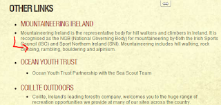
3. Formatting in Other Links. Again, a little formatting hiccup that should have been picked up straight away.
4. Contact Page. This is perhaps the worst designed page on the site. First off they seem to want to SHOUT about GROUP and CHILD PROTECTION POLICIES. Then there is a nice map, but no location placed on it. Sure National Office is somewhere there, but where? Then I only noticed it out of the corner of my eye, there is a contact form (with an missing image). There was no mention of filling out a form on the page, it is just there!
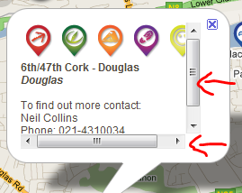
5. Group Locator page. When you click on a group, you get a nice balloon popping up with details of the group. It is however butt ugly with scroll bars. Format it correctly please!
Final Thoughts
On the design of the site, I think the banner is too big, the duplicating of the groups and ages on the main page takes up far too much space. There is no RSS for the latest news and no social media integration (HUGE opportunity missed here). I believe the correct term is Scouters not Leaders as National Office has drilled up for the past few years, but decided to let it slide on their national website.
Ok, it is a website for the general public and we will have to wait until next Wednesday to see the amazing my.scouts.ie website for actual members to use. Overall it does its job but there is a lot of really bad mistakes. I've been trying to look at it in the mind of a potential youth member or parent and hopefully it will increase members and raise the profile of Scouting.


No comments:
Post a Comment